GP
Glos Pomorza Headquarters
location: Koszalin, ul. Mickiewicza 24
project: 1997-98, competition – 1st Prize
construction: 2000-2001
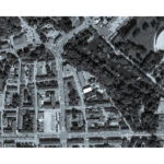
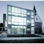
The building which houses the editorial office of Głos Pomorza daily was erected in the north-east part of the former old town. Considering an irregular development, this is a special fragment of the town encircled with old city walls. This irregularity was the result of the fact that a Cistercian convent existed in this place when the town was located; after the convent had been secularized, a residence of Kamień bishop was situated here. The only element which remained is the former castle chapel, which is now an Orthodox church.
The design of the new seat of the editorial office of Głos Pomorza daily was treated as an opportunity to heal the whole area by the city walls in this part of the town. The chief deficiencies of the present state are as follows: lack of clear lines of the development, an undefined context of the Orthodox church and an accessibility of the Town Park.
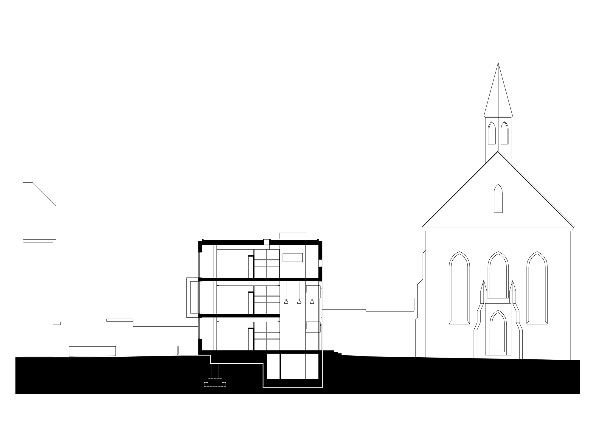
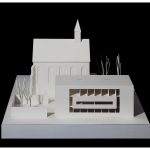
Owing to the direct location of the building by the street of Mickiewicza, it was possible to organize the area by the church and restore to its former position in the urban planning context. A square is the main spatial element which organizes the area around the church. The building of Głos Pomorza constitutes the north frontage of this square. It is also here, from the side of the square, that the entrance to the building was located; this additionally emphasizes the function of the square. The axis of the square is at the same time the axis of the church. More important passages were designed parallel to it between the street of Mickiewicza and the Town Park.
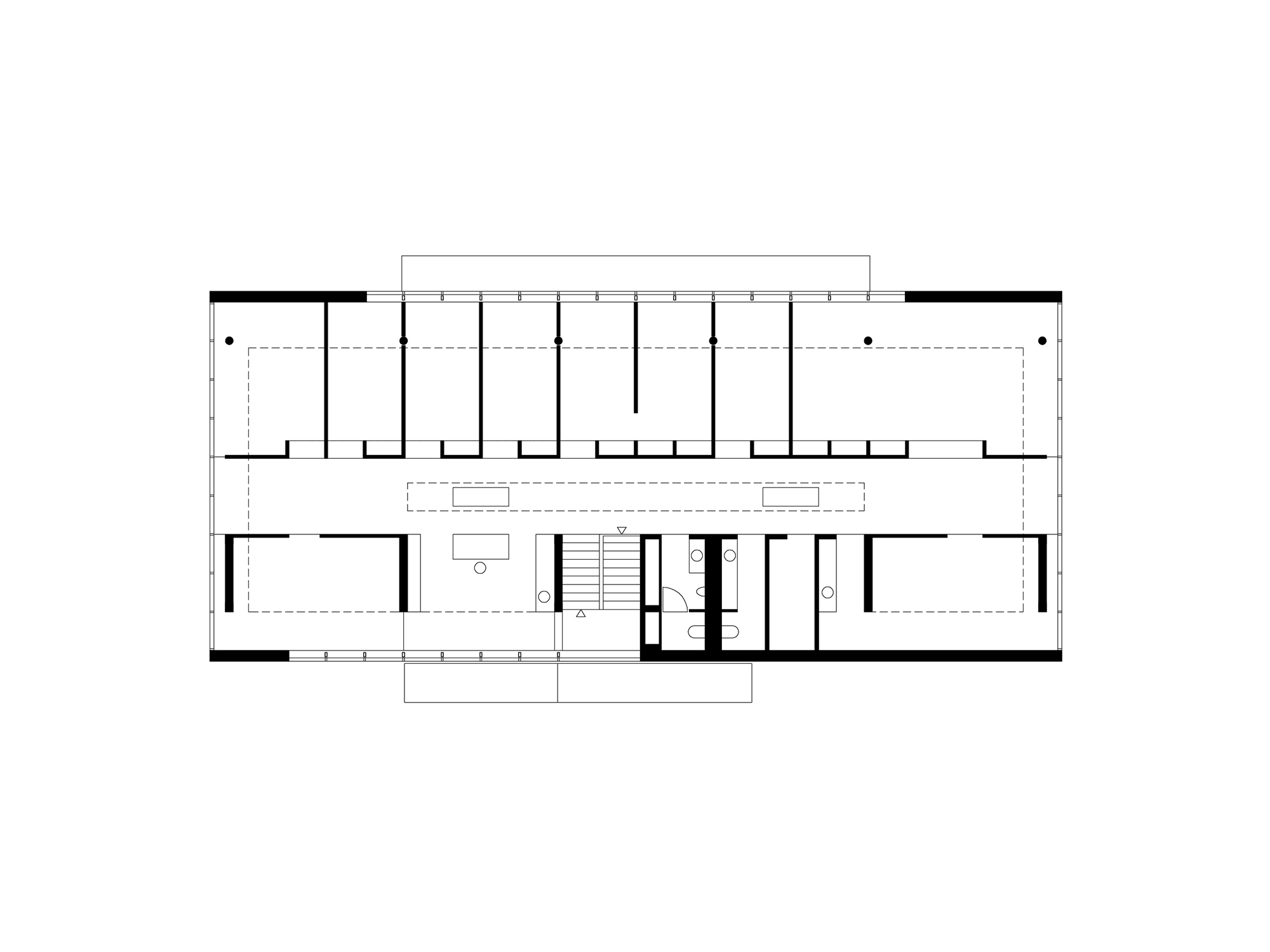
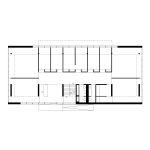
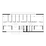
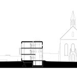
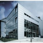
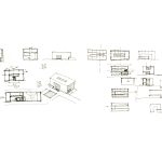
A simple form based on a rectangle projection was the starting point of the body of the building; its height was limited to the cornice of the church. This form reacts with its structure, cut-outs and the facade composition to the urban-planning context of the place. Efforts were made to limit formal procedures only to the change of the material in the same plane so that the facades could have a maximum smoothness.
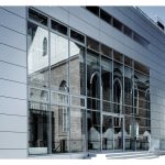
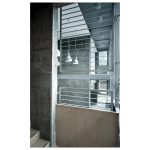
With its materiality, the building of the editorial office intentionally emphasizes its novelty in this area: see the monochromatic facades (steel sheet, aluminum window sections and sun shutters). Nevertheless, it is its location, scale, and proportions which permanently link this building to this place. These are elements which do not follow fads. The purpose of resigning from the contextual use of materials for the facade is to focus on these timeless values in architecture.
architect:
piotr smierzewski, freier architekt, karlsruhe
dariusz herman, koszalin
collaboration:
filip golebiowski, mateusz polak
status:
completed
Building Footprint: 328 m2
Net Floor Area: 962 m2
Gross Floor Area: 1121 m2
Volume: 3565 m3
Publications:
1. Kontext a Typologie, KRUH, Texty o Architekture 2015-2018
2. 101 Landmarks of Contemporary Polish Architecture, Agora 2011
3. Głos Pomorza, Architektura 10/2001
4. Głos Pomorza, Architektura i Biznes, 1/1998
more: smierzewski.com
