EXPO 2000
Polish Pavilion
location: Hannover
project: 1999, competition entry
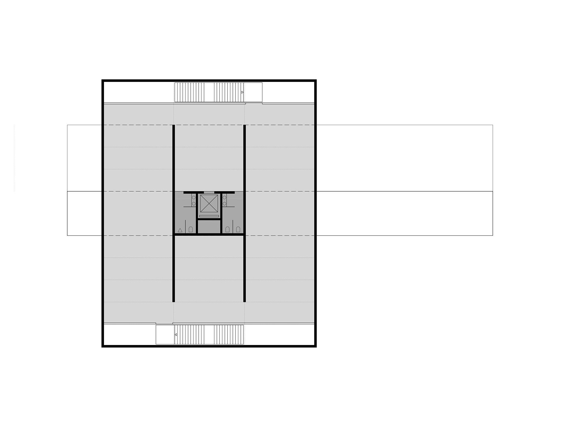
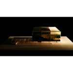
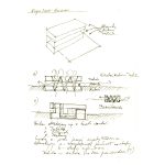
The main theme of this pavilion is equilibrium but not weight. It is not an object but a notion: an idea of equilibrium transported in an abstractive and logical manner into a specific architectural form. With its composition, the building intentionally reduces its building area to a minimum, by which it is made similar to the structures of most of living organisms (e.g. trees). The space thus obtained allows one to organize outdoor events which encourage those passing by to visit the pavilion. It also adds a Polish motif to the main greenery belt running from the south to the north of the exhibition grounds.
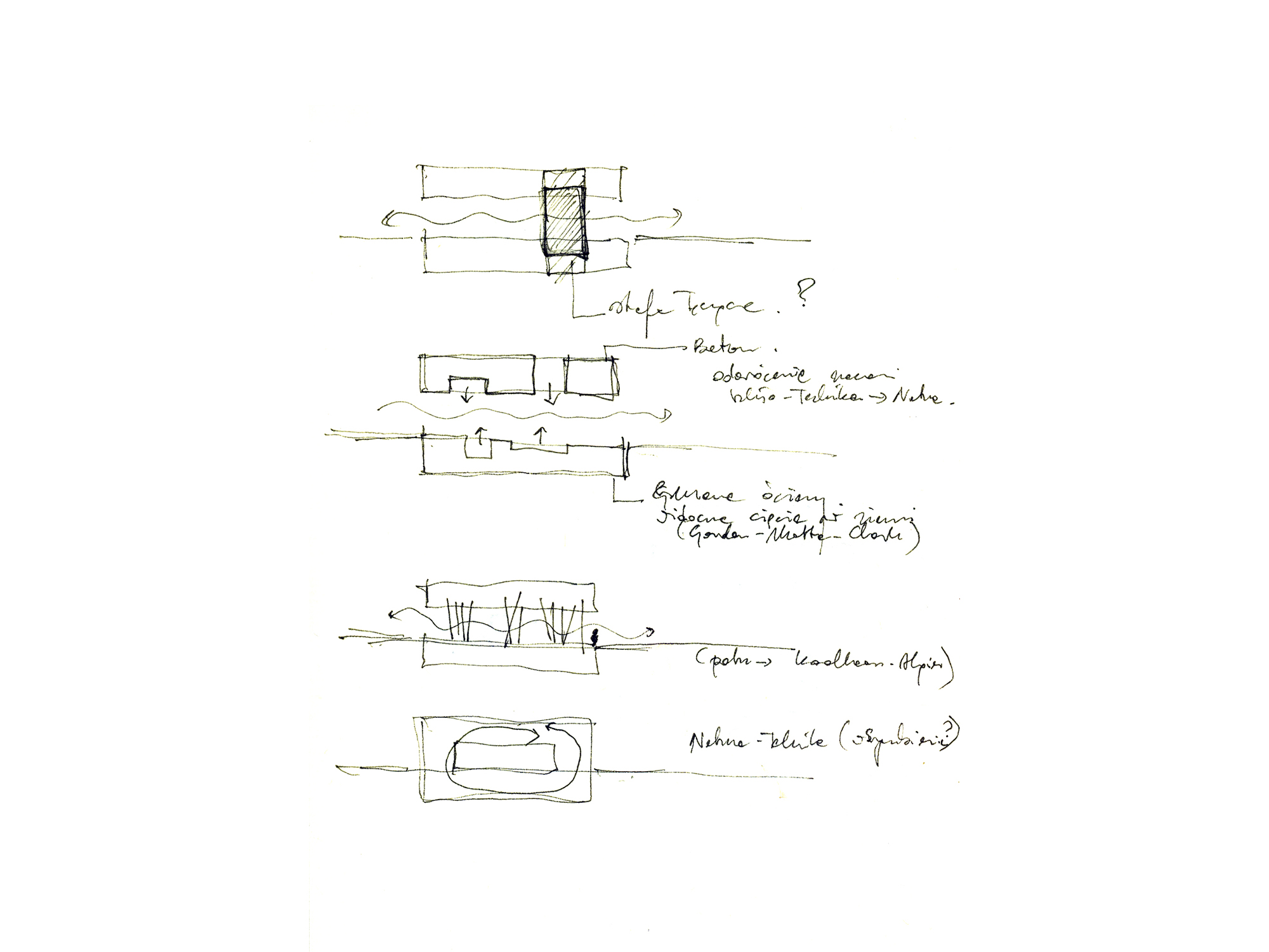 The massive first floor divides the area into two differently arranged zones. The south side of the plot is devoted to nature; it is freely arranged, which is evident in the modulation of the grounds with soil from foundation trenches. The north side, which has a closer contact with the entrance section and the main access routes to the exhibition area, is to display technology.
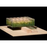
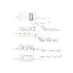
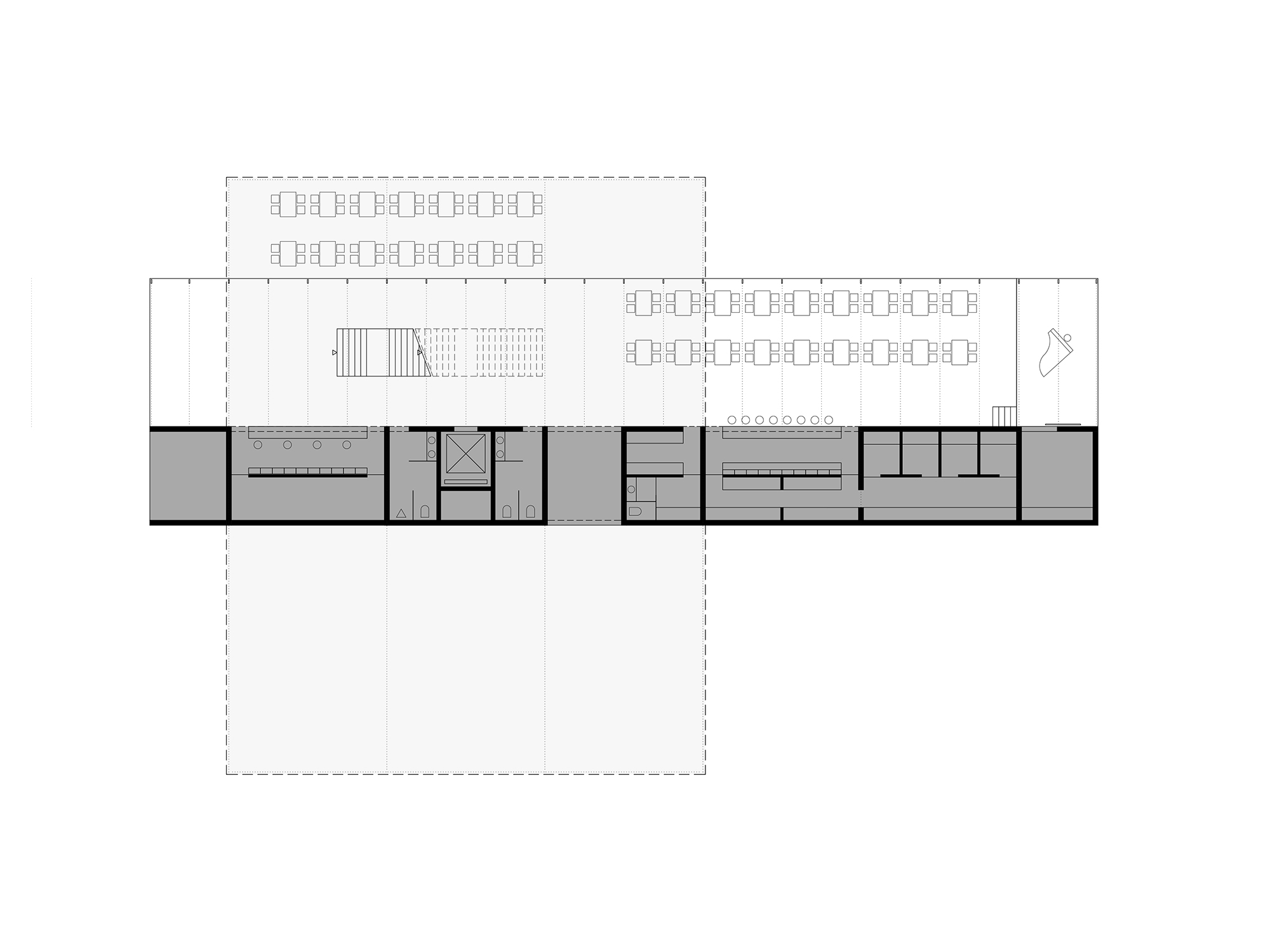 The pavilion consists of two elements which are different as regards their formal and functional aspects: lower and upper, entrance and exhibition. The lower part, which is closed in the form of an elongated cuboid divided into massive and transparent zones, was established on the axis of the main entrance. The massive zone includes a number of auxiliary functions. The transparent zone is open towards the main access routes to the exhibition grounds. It constitutes a transitory space communicating with the external area.
An entrance hall and a restaurant are located here. Owing to the concentration of the auxiliary function in the lower part, a less limited decor of the exhibition part is possible. The two elements, which are oriented differently (the axis of the first one is horizontal: east-west, and the axis of the second one is vertical: earth-sky), create two disparate moods. The lower part is ready to accept and neutralize chaos, while the upper section is filled with the right atmosphere for the contemplation of the exhibition. On the second floor (the first exhibition floor), the exhibition area is accompanied by the administration area.
The facades reflect the main functional guidelines. The lower facade is extravert and communicates with the outside world. The upper one is introvert and is directed inwards; it communicates with the elements of the exhibition. The exhibition area has a contact only with this surrounding area which the man converted to a minimum extent. The exhibition area is encircled with a light double facade made of glass and filled in with conifer needles.
The facade designed in such a manner gives a controlled transparency of the casing and an impression of massiveness from the outside; at the same time, it grants a poetic feeling to the boundary between the interior of the exhibition pavilion and the external space of EXPO. Such a facade could illustrate the motif of the cyclical character of nature. During the World Exhibition (late spring until autumn), the facade would adapt its colours to the natural cycle.
architect:
piotr smierzewski, freier architekt, karlsruhe
dariusz herman, koszalin
status:
concept design
Publications:
1. Kontext a Typologie, KRUH, Texty o Architekture 2015-2018
2. HS99 – Niematerialne, Archivolta 4(44)/2009
more: smierzewski.com

